
Is your website mobile friendly?
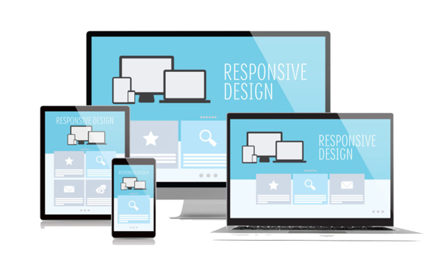
A mobile friendly website is a website that renders well on small screens like smartphones & tablets. Mobile friendly websites are also called ‘responsive websites’ because they respond to the size of the screen that the site is being viewed from.
These websites have larger text that is easily readable, touch-friendly buttons, faster download speed and page elements in sync with mobile devices. Without mobile friendly (or responsive) design your website is more difficult to use and requires visitors to zoom into content in order to read it. The experience results in a poor opinion from the visitor who is unlikely to contact you for business.
Currently, almost 60% of websites are visited using a mobile device. People (your prospective customers) are searching for and checking websites when they’re standing in line at the grocery store, sitting in the park, watching TV, the list goes on. In a nutshell, anywhere there is an Internet connection, you can easily assume that smartphone users are accessing websites. As such, its imperative that if you want your business to be found and taken seriously, it needs to be mobile friendly.
Do you have a mobile friendly website?
Unsure of whether your site is mobile friendly? Click here to check.
So what do you do if you find that you don’t have a mobile friendly website? Well you could just leave it, but that isn’t going to help your business generate leads from your website, is it. So we suggest that you contact us and we’ll have a look at your existing website to see what is involved in making it mobile friendly. It could be just some extra coding that’s needed to make it into a mobile friendly website, alternatively, you may need to have the site layout re-done from scratch. Either way, we’re in a position to assist you quickly and affordably so that your website presents an easy-to-browse, professional image to your prospective customers.