
What is a responsive website?
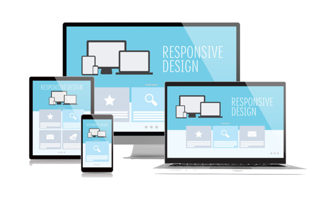
The introduction of smart devices and their ease of availability have shifted the use of the internet, from desktop PCs to hand-held smart devices. A research suggests that the year 2015 will witness internet usage on mobile devices to match the usage on desktops. This means that all businesses should ensure that their websites are compatible with these devices. Being compatible in this way means that the website automatically detects the device, while it is being viewed, and adapts to the screen size for easy viewing. This adaptability feature is known as Responsive Website Design.
Despite the increasing use of the smart devices, some companies still deny the fact that there is an essential need for responsive website design that enables a better user experience. Apart from the ultimate UX that the responsive website designs provide, here are the five other top reasons that explain why incorporating responsive website design is necessary:
Search Engine Optimisation
Google, being the search engine giant, pretty much dictates what needs to be done for search engine optimization. In its numerous suggestions on how to gain high rankings, one of the important ones is the use of responsive website design. Google has clearly indicated that it prefers responsive designs to the mobile templates. The use of a single URL with the responsive design makes it easy for the search engine robots to crawl and index the website. This also helps greatly in reducing the on-page search engine optimization errors.
Reduced Bounce Rate due to Better User Experience
A responsive designed website offer users various features when accessed on a mobile device; the website either adapts to the screen automatically or tries to reload to the mobile version. The latter option is slow and usually results in the page errors. This makes the user turn back to the search engine results page for the alternative websites. This increases the bounce rate and indicates to the search engines the ability of the website to generate interest. However, if the website has built-in responsive web design, then, the page opens almost instantly, fitting to the screen size, as it does on the desktop. This makes the user stay on the webpage and browse around easily, thereby reducing the bounce rate.
A Single SEO Campaign
If businesses do not opt for responsive web designs, then, they have two websites to manage – the mobile version and the one established on the new media. This practice increases the workload of managing the services. Moreover, the businesses are required to formulate multiple SEO strategies to gain page rankings on the same search engines. However, with the responsive web design option, the businesses need to focus solely on the main website functioning. A single SEO campaign is adequate to maintain the page ranks, as the mobile versions are a part of the website. Moreover, with this option, the content plagiarizing practice is reduced greatly.
Easier Long Term Maintenance
A responsive website designed page is much easier to maintain than the mobile versions of the main websites. This is because the smart devices are updated at instant speed. This means that the mobile version of the websites would need to be updated at an equally fast pace if the mobile site is to work on these devices. This makes the maintenance of a mobile site not only tiresome, but also expensive. A slight lack of update in the website can harm the business by increasing the bounce rate. This is why the responsive website design is a suitable option for the fast-paced tech development.
Increased Sales
A well-designed website, offering a friendly-user experience, can make good use of the web content to drive sales. A good website design is user-friendly and accessible through smart devices, which helps the business reach out to wider niches and the targeted audience. Use of the smart, user-friendly web designs give advantage to business entities. A business with innovative, hi-tech services is likely to win over the rest of its competitors.
Smart phone devices are most commonly in use these days. According to a calculated figure, 5.1 billion, out of the 6.8 billion-world population are smart phone users. This further endorses how important it is to shift to the responsive website designs, in order to create a better user experience for the billions of people.
Click here to check if your site is Google ready/mobile friendly/responsive and if its not, remember that we can do a full website upgrade with responsive design & data migration for you without breaking the bank!